Restaurant
Group Project with Quynh Le Truc


Concept
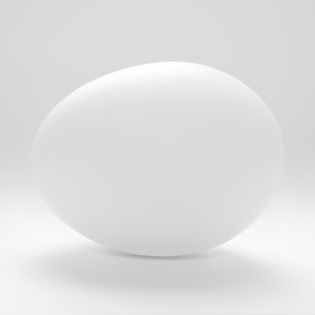
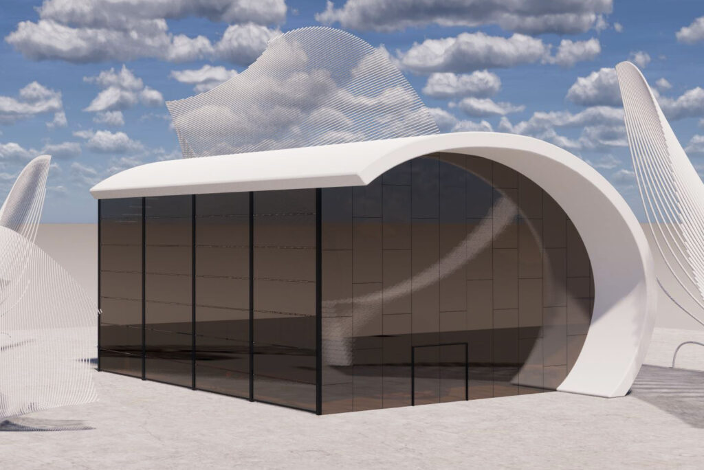
Chick-fil-A
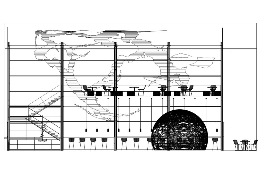
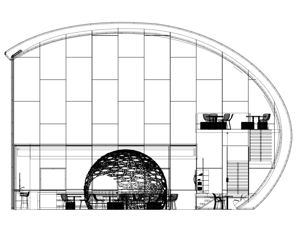
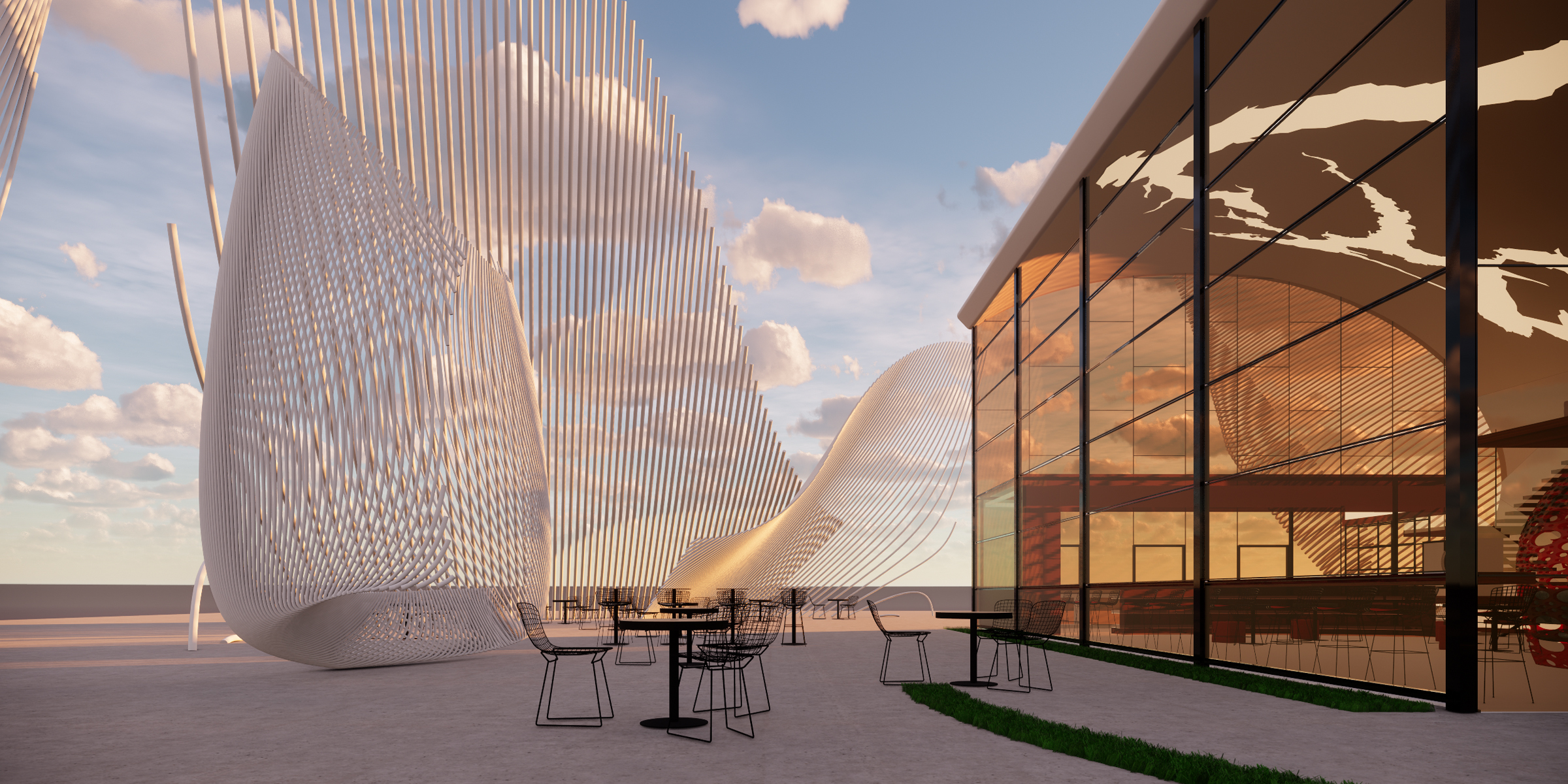
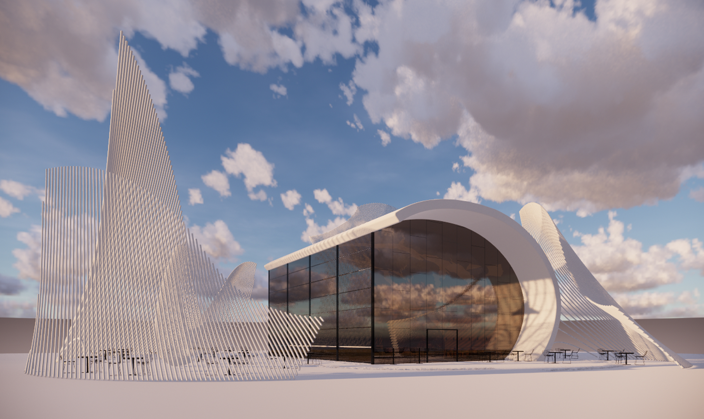
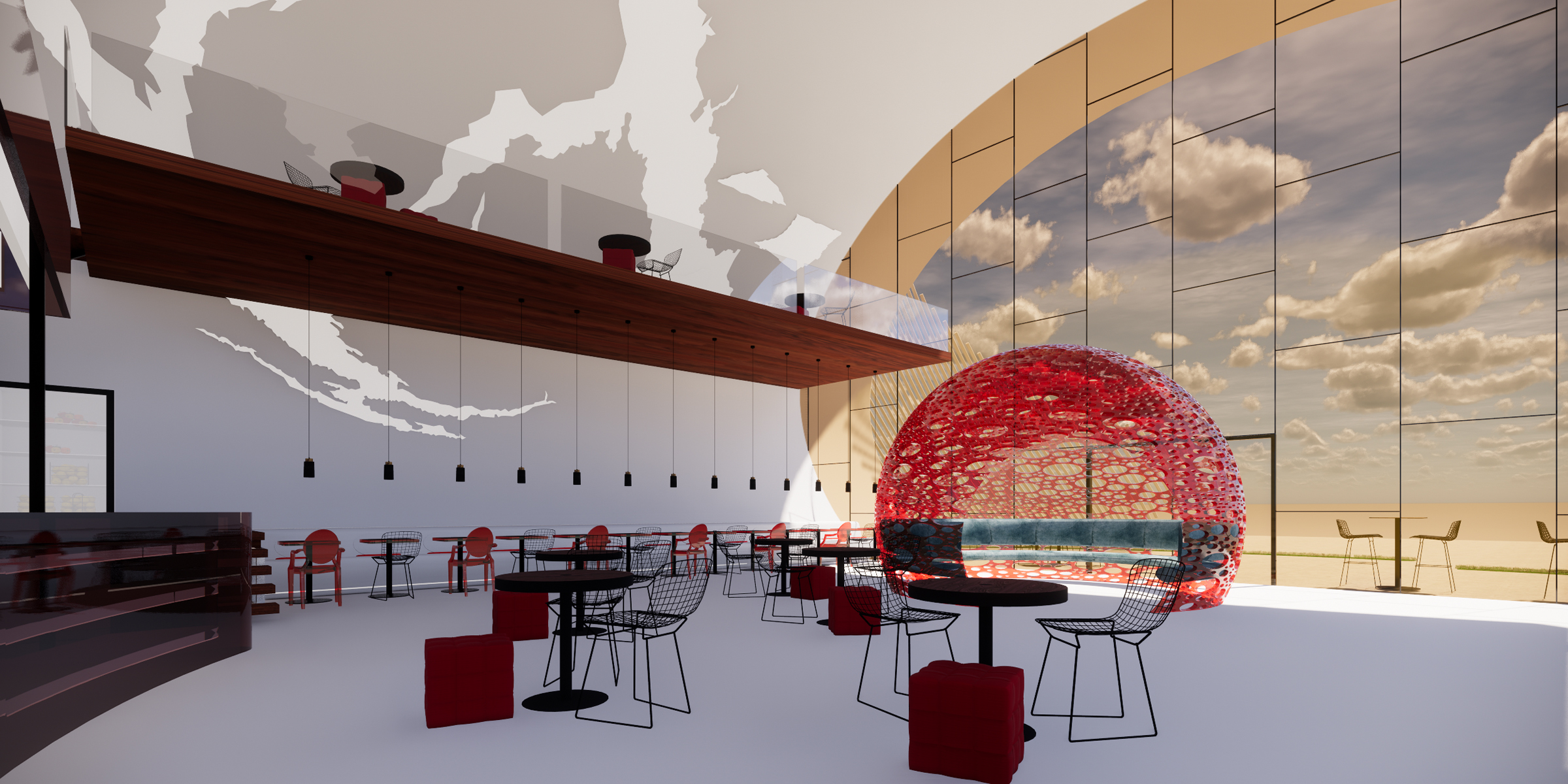
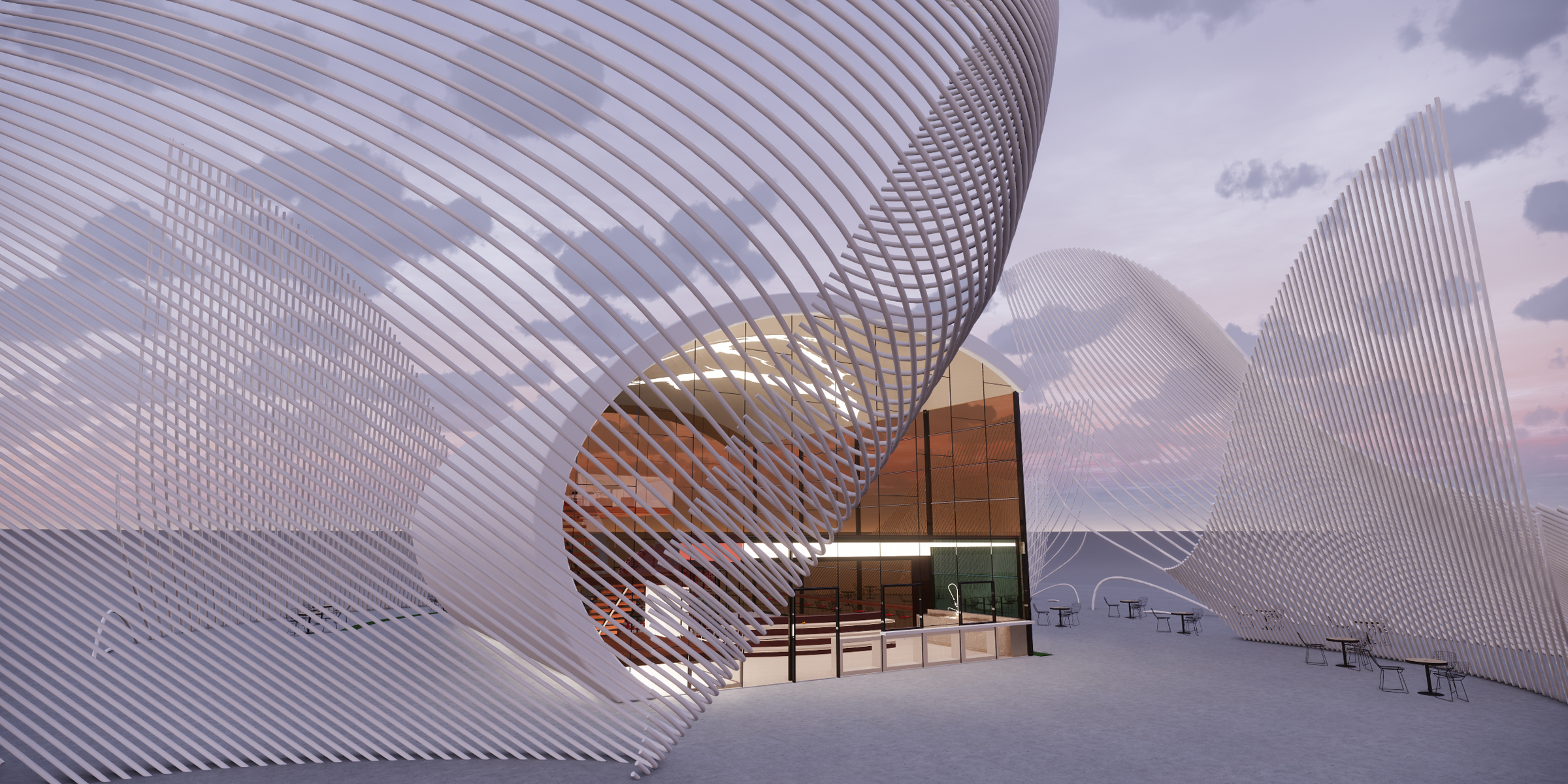
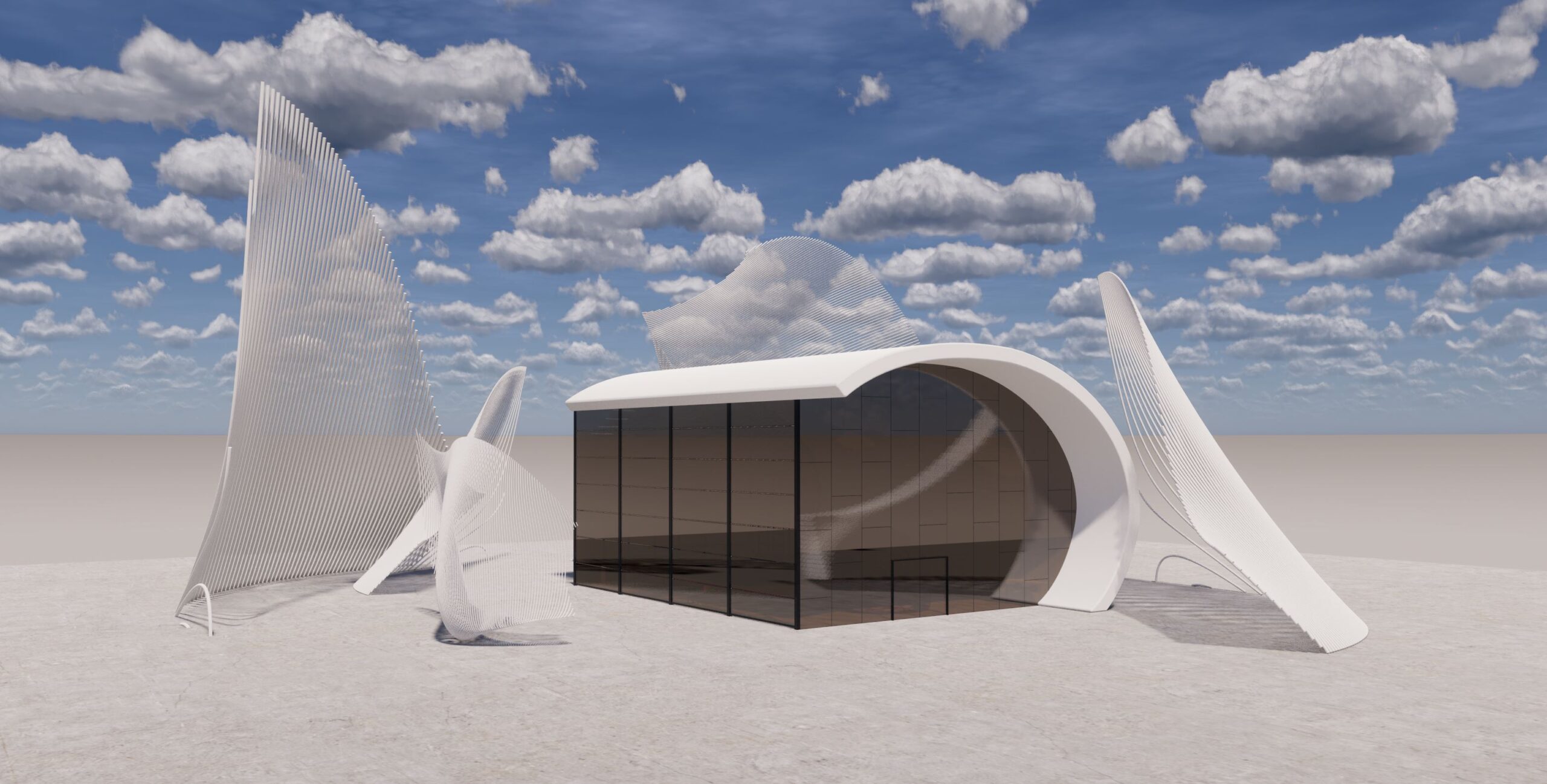
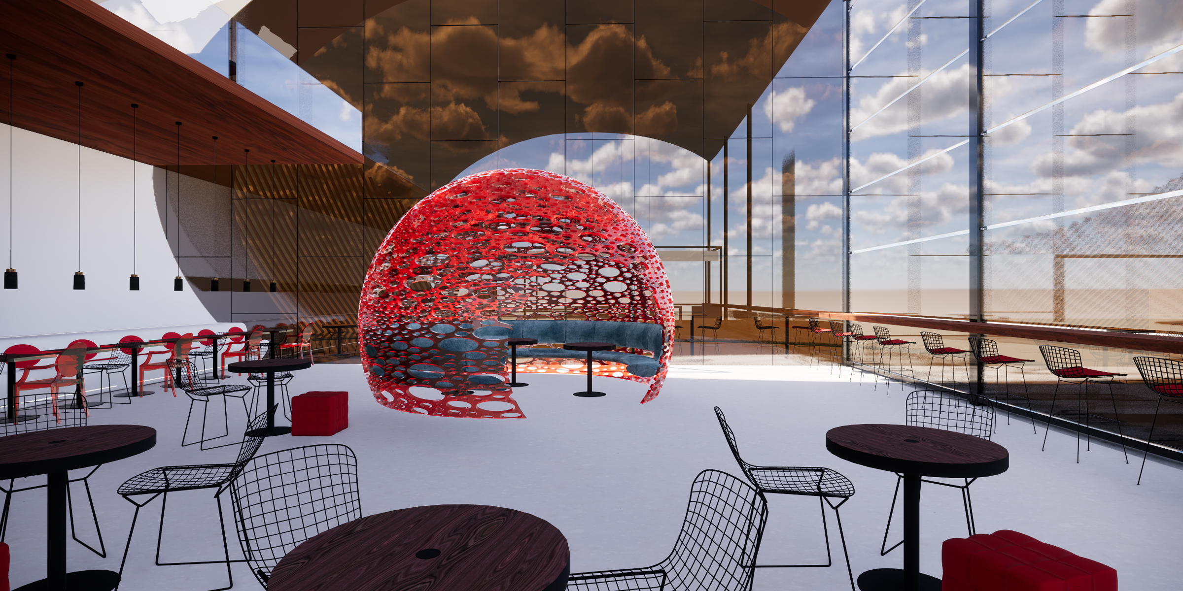
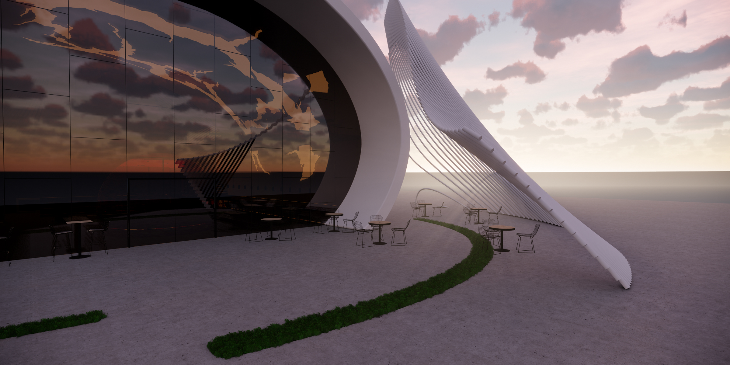
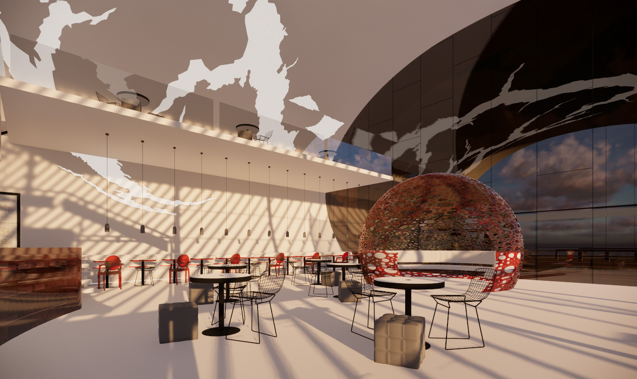
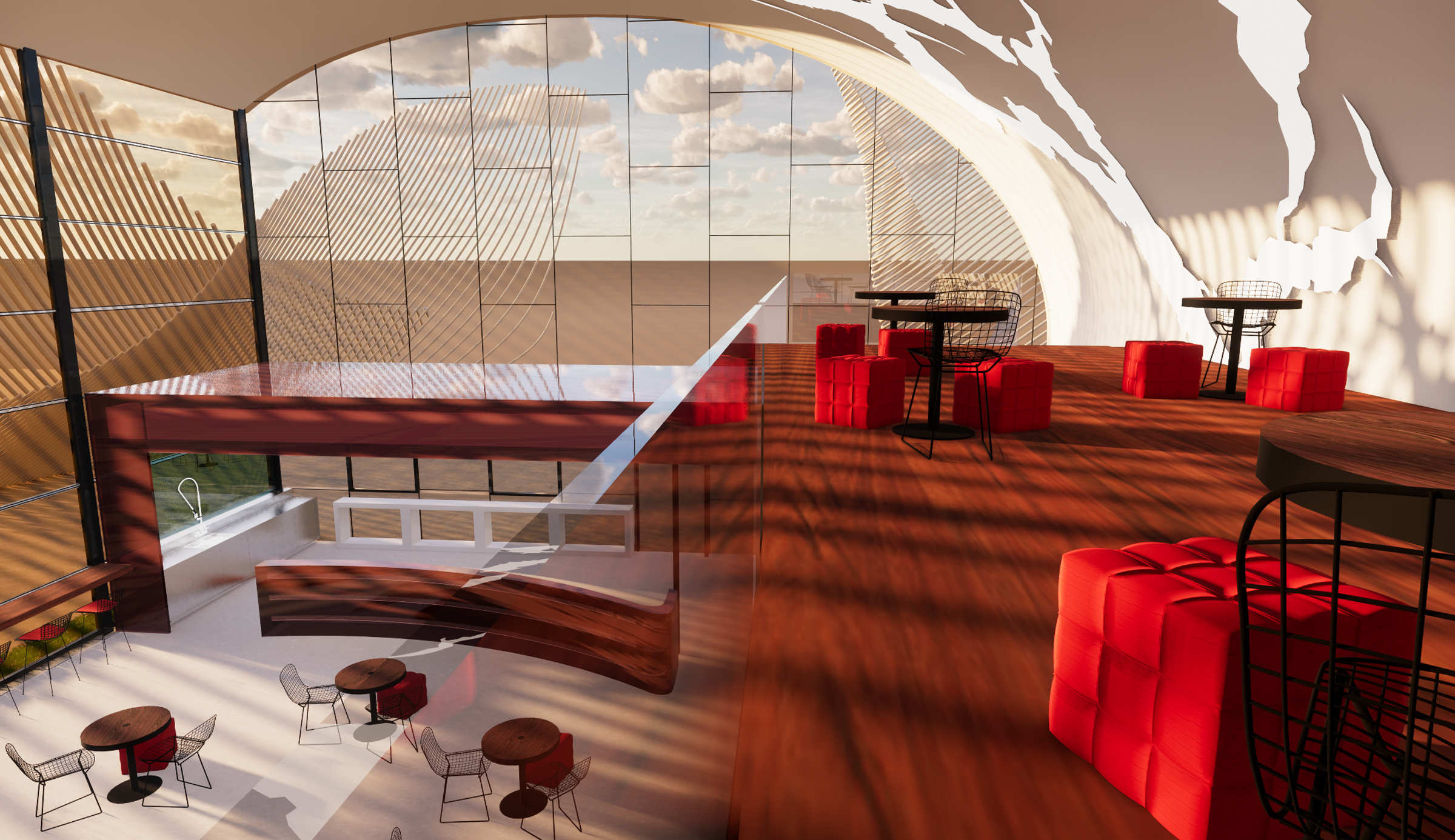
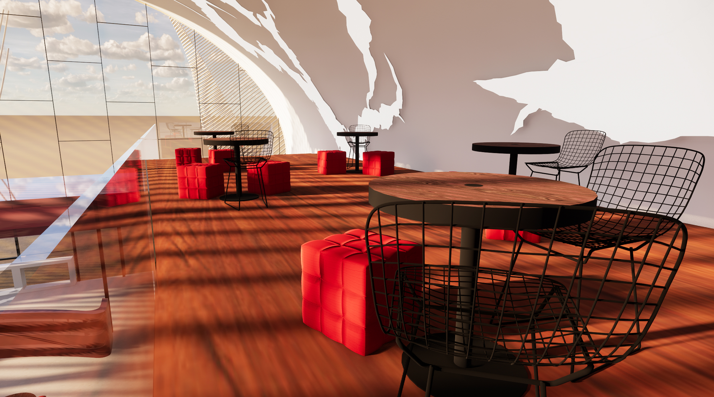
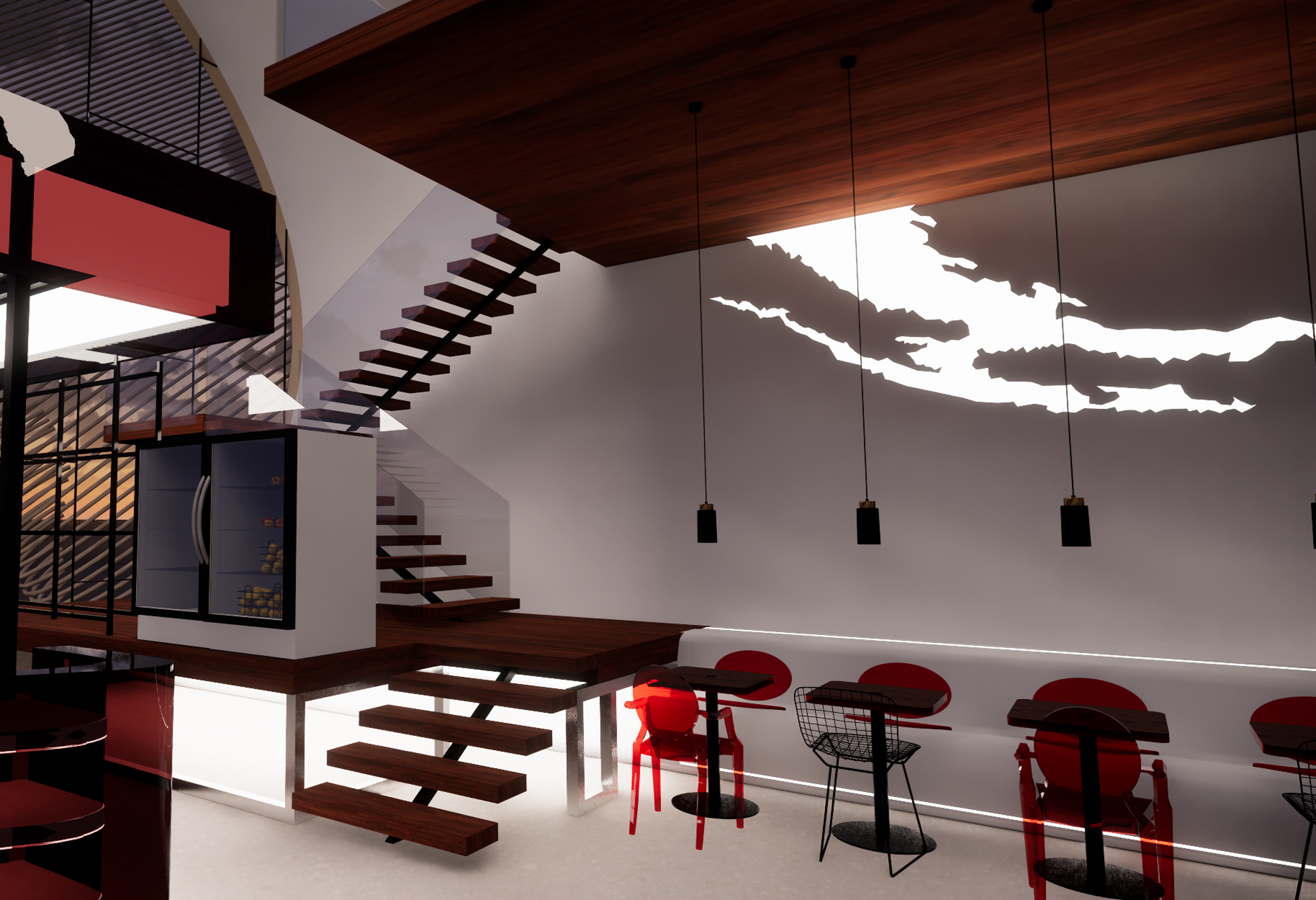
Stylizing the identity of the company and its logo, we follow the direct way from the name itself. We brainstorm Chick-fil-A and all elements, that connected with chicken we have chosen the egg as the main element of design. Egg shape, texture and color was the base for the design. Integrating egg shape into interior also into the architecture. The curve, which starts from the corner of the ceiling on one side going all the way across the ceiling and finishes as an integrated seat on other side. The egg shape of the exterior making Chick-Fil-A visible and recognizable from far away.
Working process and inspiration
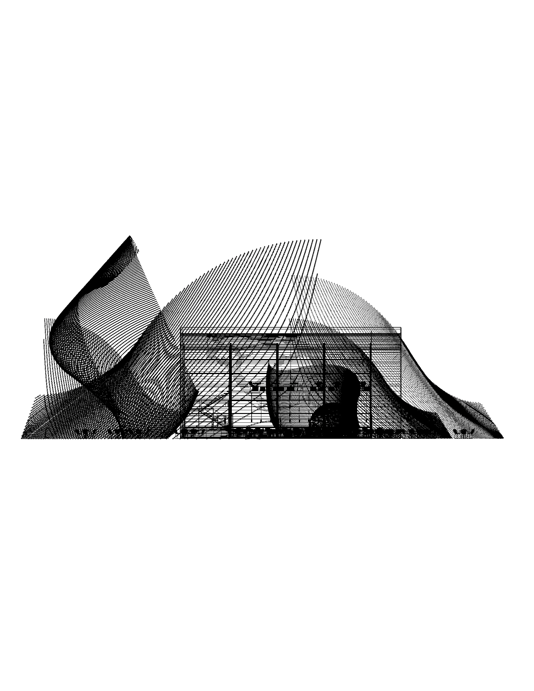
 Architectural Contraction Element Inspiration
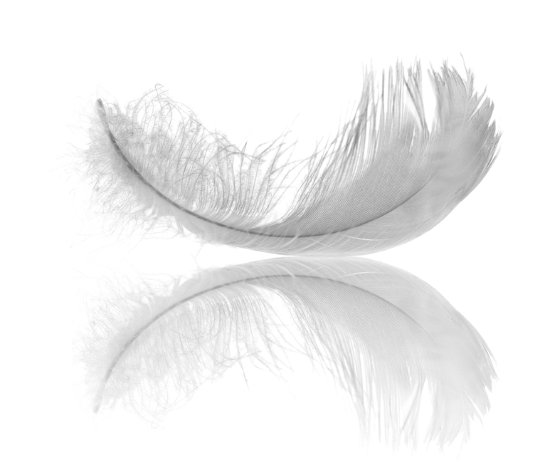 Landscape Design Element Inspiration
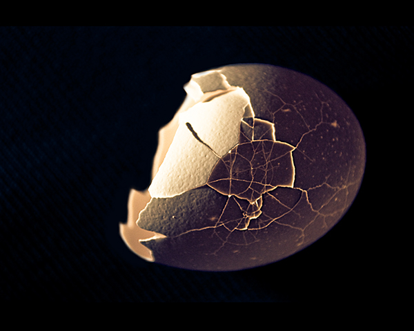 Lighting Inspiration
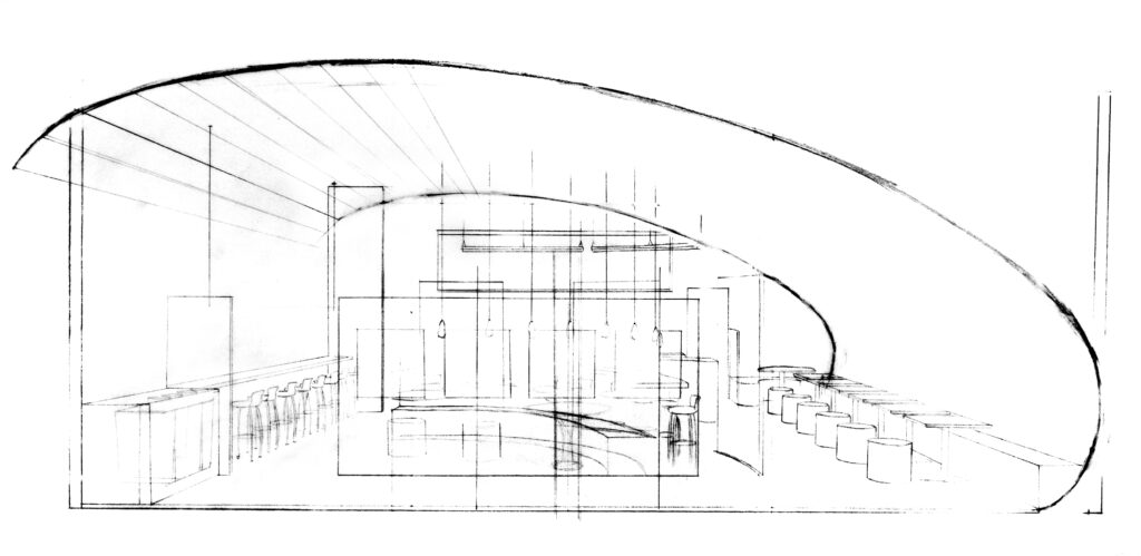 Constructional Sketch
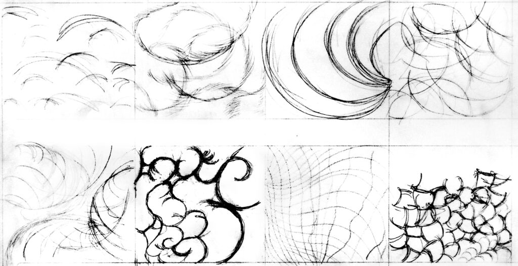 Feather Diagram
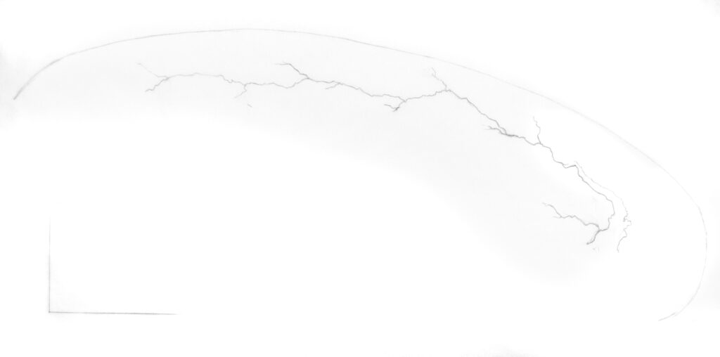 Lighting Sketch
 Fragment of the egg as an Architectural Element
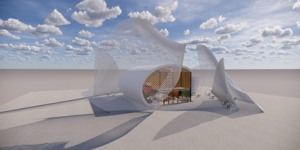 Feather as Landscape Design
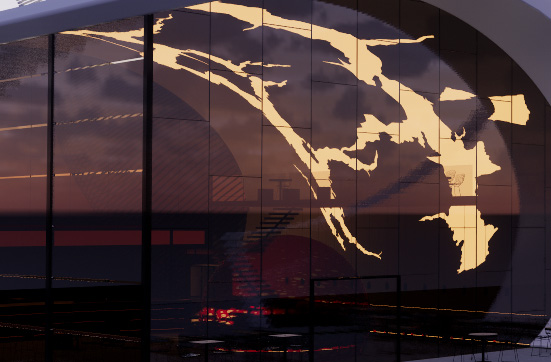 Crack on the egg as a Lighting Design
Feather as landscape design, Crack on the egg as lighting design, fragment of the egg as an architecture element